Grieg Connect
Brief
Grieg Connect develops digital tools for ports, terminals, maritime logistics and security. When two companies merged to form Grieg Connect, the portfolio consisted of six products with completely different visual expression, interaction principles and technical architecture. The challenge was to bring this together into a cohesive product portfolio.

Strategy
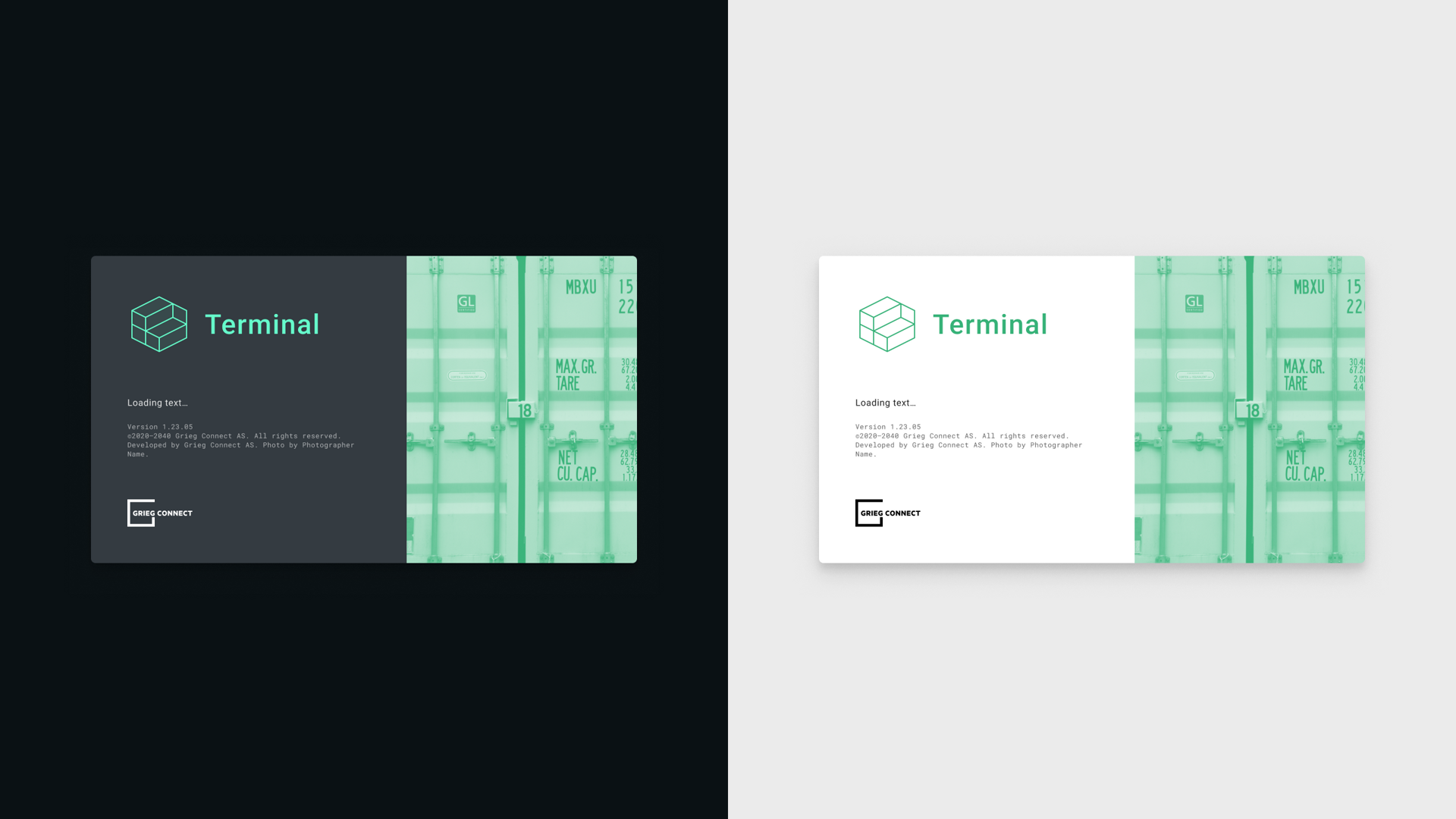
The strategy was to bring the products together around a clearer shared language. Product names and communication were to become easier to understand, the visual expression more cohesive, and the interaction friendly and consistent. Components and solutions developed for one product were meant to bring value to every team and the whole product line. A flexible framework would make it possible to build faster as the system grew.
Result
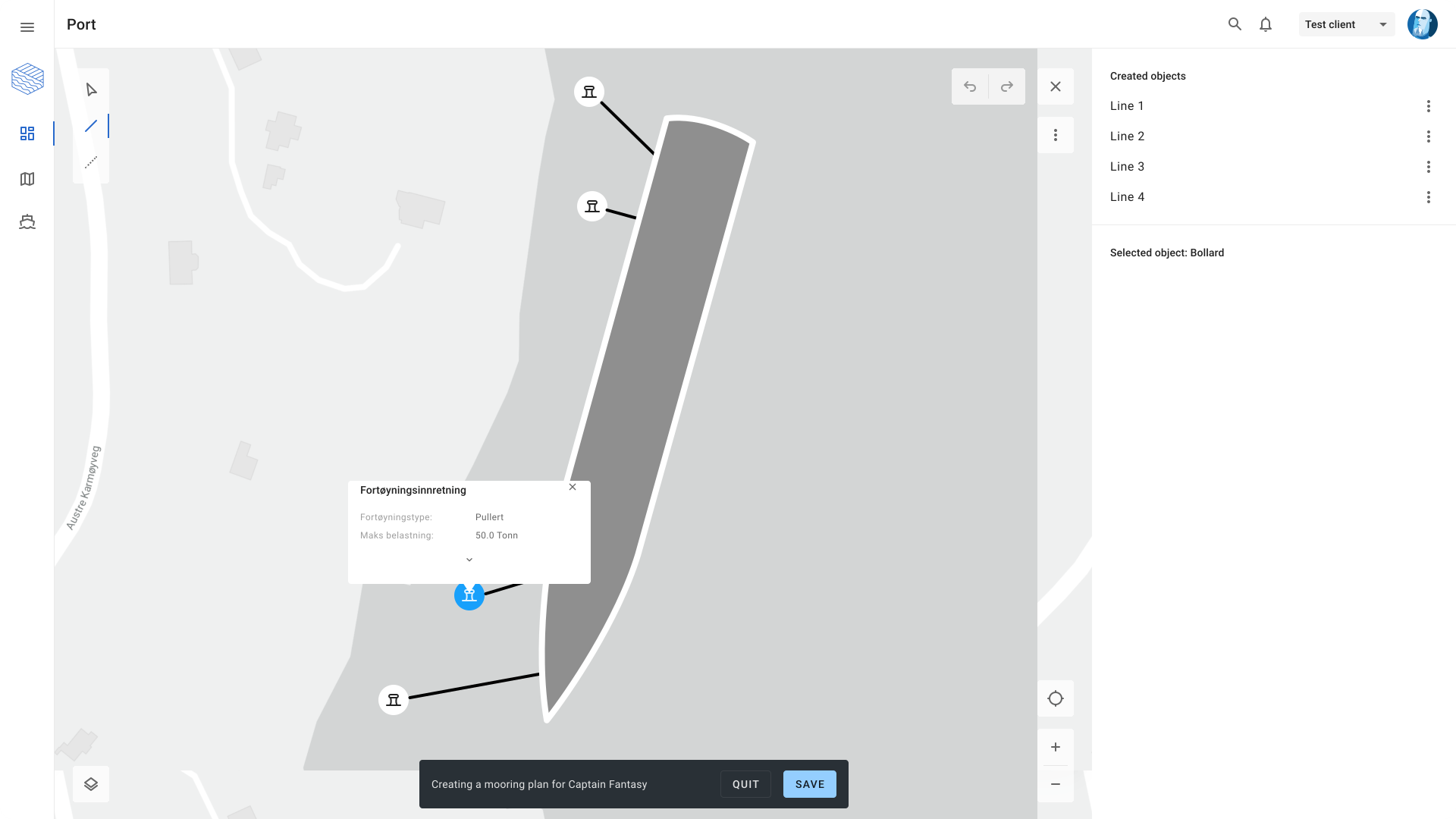
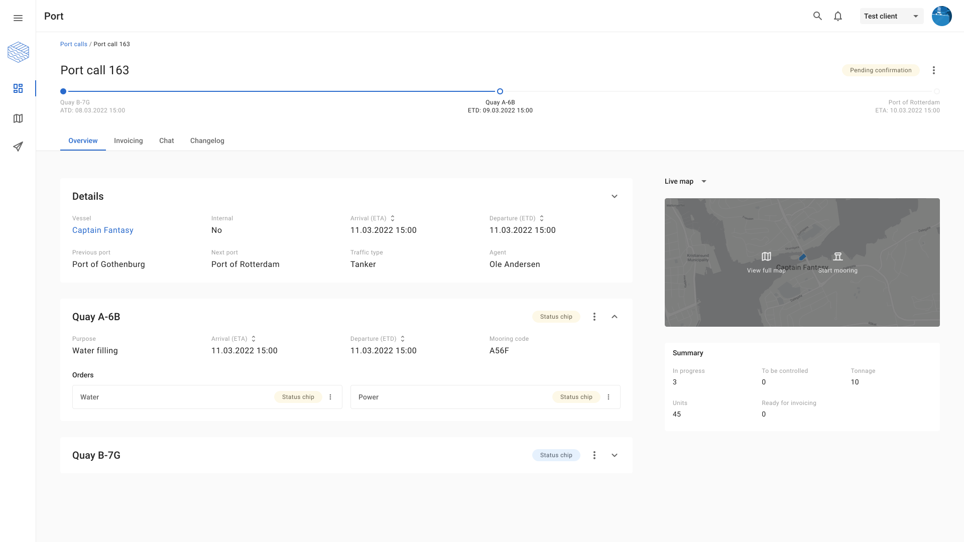
The products gained a clearer kinship, both visually and in how they worked. Good documentation and shared resource libraries made further development faster, while design understanding across teams grew. A stronger grasp of users' challenges contributed to better decisions. At the same time, ambitions and confidence grew internally, as the portfolio came across as more cohesive, considered and professional.
Visualising product value
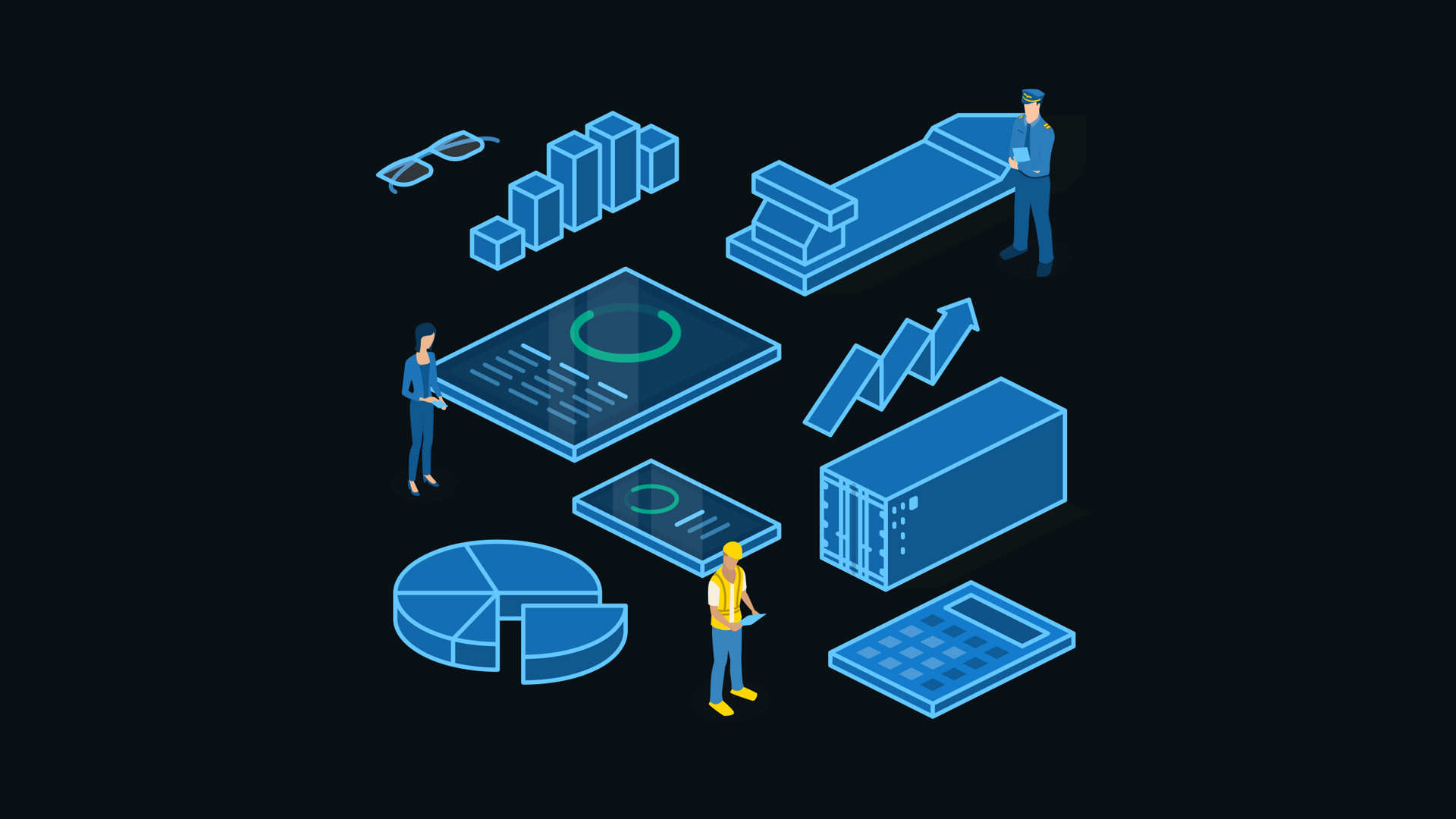
We created a considerable set of value and feature illustrations to make complex software capabilities easier to understand. Each illustration focused on the user benefit behind a specific feature, helping customers see what problems the software solved and why it mattered to their operations. The illustrations were used in onboarding, on the website, in presentations and on roll-up banners.
A visual language that could move
The illustration system was developed to work across products, surfaces and formats. In motion it gained one more function: making complex relationships easier to follow, while the expression kept the portfolio visually unified.
A human face for the brand
We developed a custom illustrated portrait system in collaboration with Pablo Lobato. His geometric, cubist-inspired style gave Grieg Connect a more distinctive human expression. The portraits also solved a practical scaling problem, making new employee portraits easier to produce across multiple offices. They were used in marketing, internal planning, presentations and email signatures.
Identity in every detail
We developed a large pixel-perfect icon system for the applications, with more than 250 custom icons. By designing our own icons instead of using generic libraries, we carried the identity into the smallest parts of the product experience. The icons supported navigation, documentation, manuals, presentations, printed media and other brand touchpoints.