Voss Fellesbryggeri
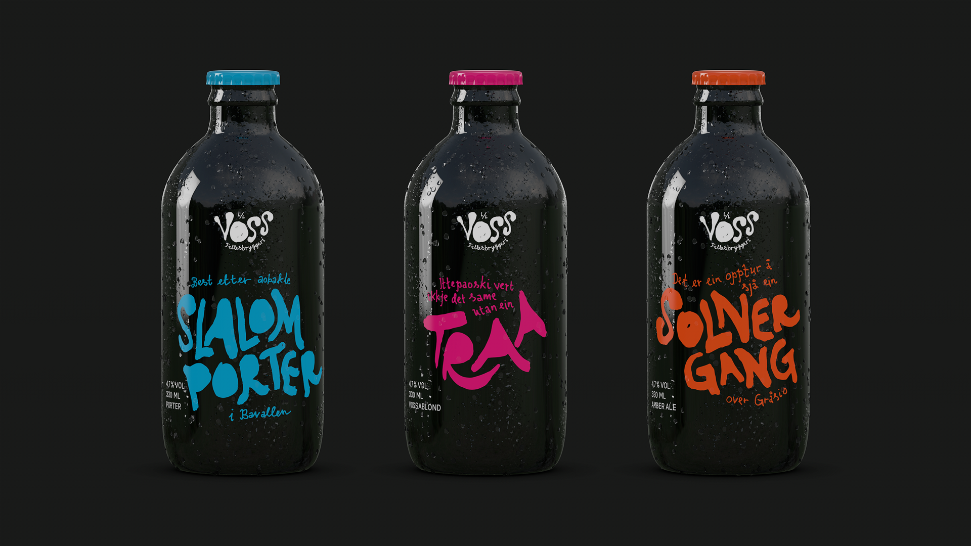
Brief
Voss has a strong tradition of brewing homemade beer, but bringing that culture to a national and international audience risked making it feel generic. The identity needed to communicate provenance and quality while preserving the humour, informality and particular way people from Voss express themselves.
Strategy
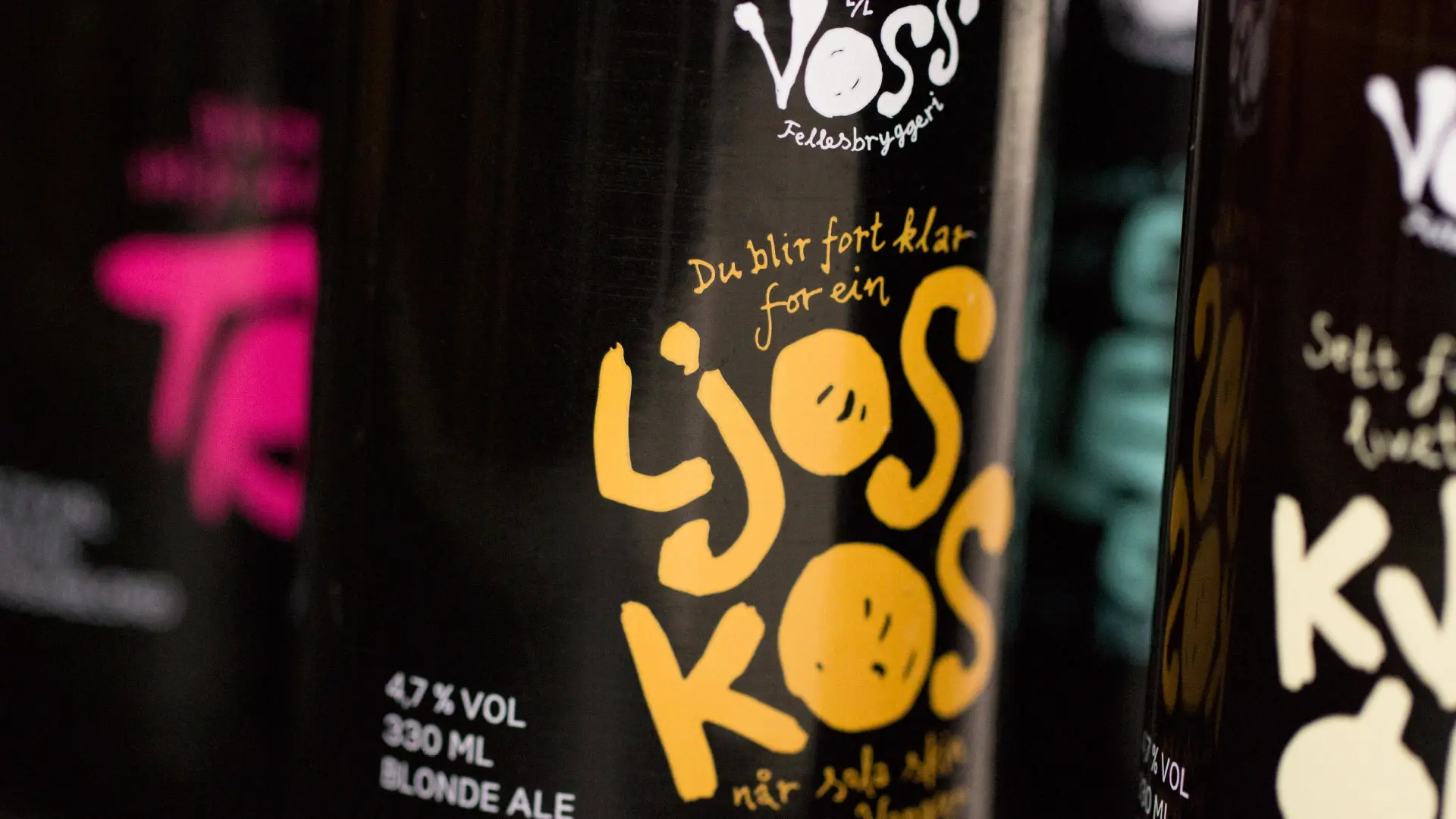
Instead of polishing away the local character, it was turned into the very strength of the identity. Handwriting, spoken phrasing and genuine Vossa dialect gave the identity a human voice. The goal was to create something that felt close, distinctive and self-assured.
Result
The result was a clear, outspoken identity with strong local roots. In a category shaped by established codes and traditional beer aesthetics, the expression became a visual revolt on the shelves. Short, black bottles, contrasting colours, handwriting and direct language gave the range strong recognisability, while each variant could carry its own personality without losing the whole.
Vossa-speak
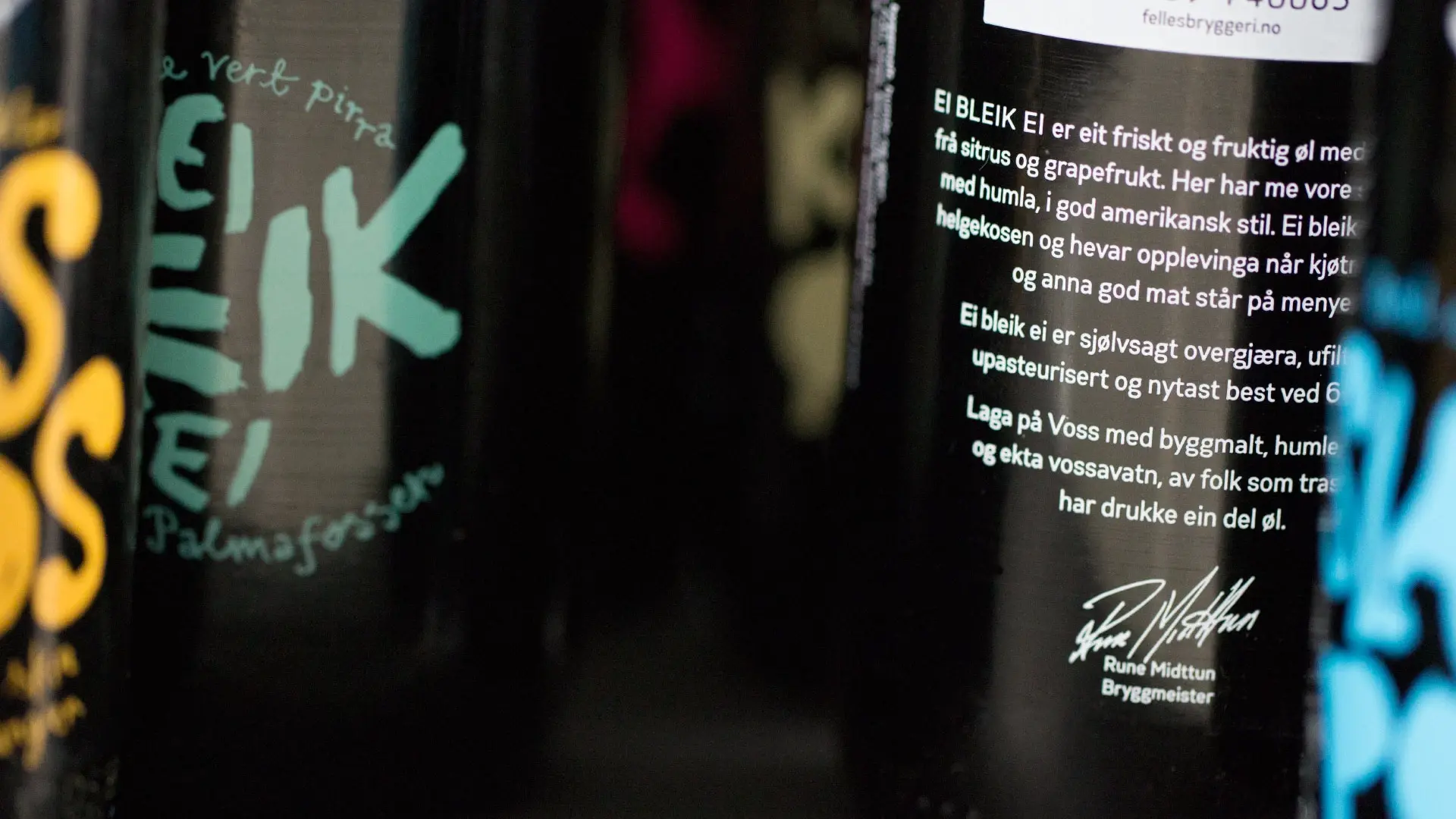
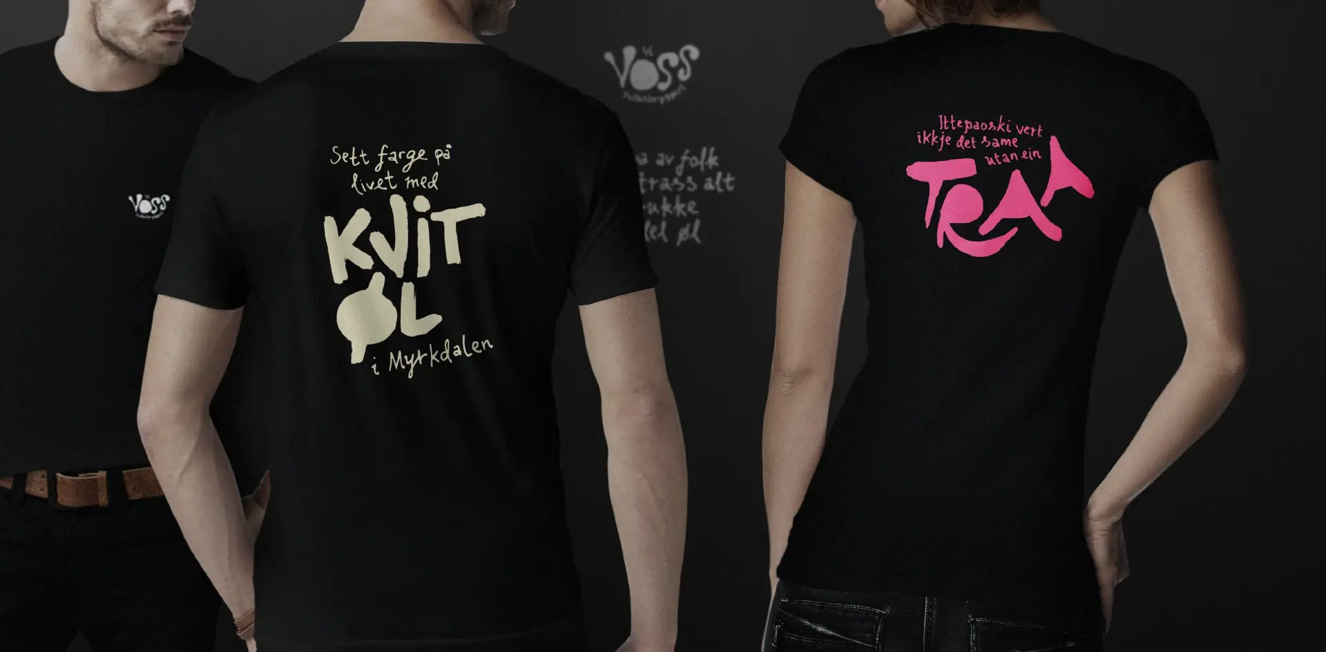
Language became just as important a part of the identity as the visuals. Short sayings in genuine Vossa dialect brought local humour directly onto bottles, glasses and other materials. They were meant not just to inform, but to provoke a reaction, start conversations and give the brand a voice that was hard to mistake for anyone else's.
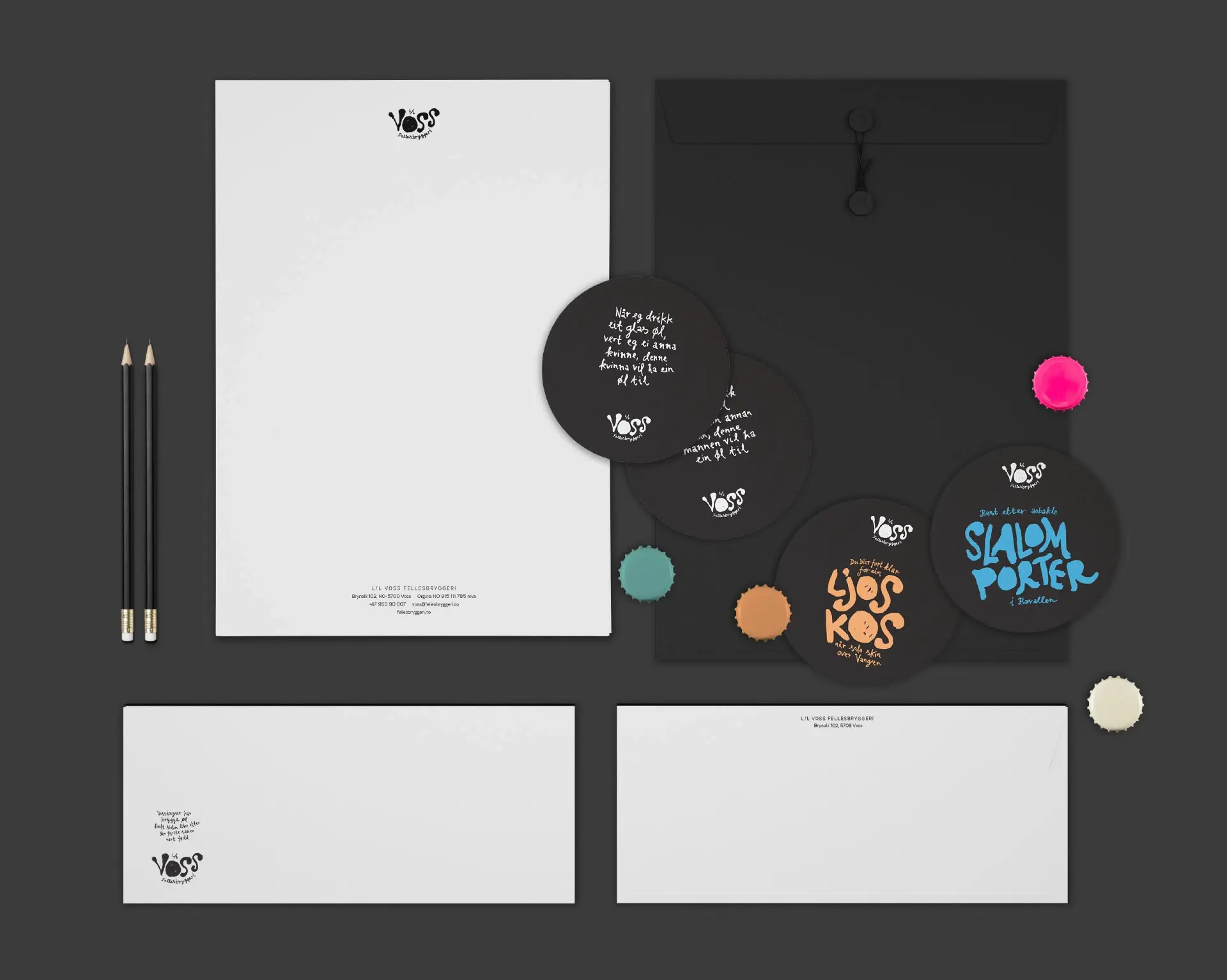
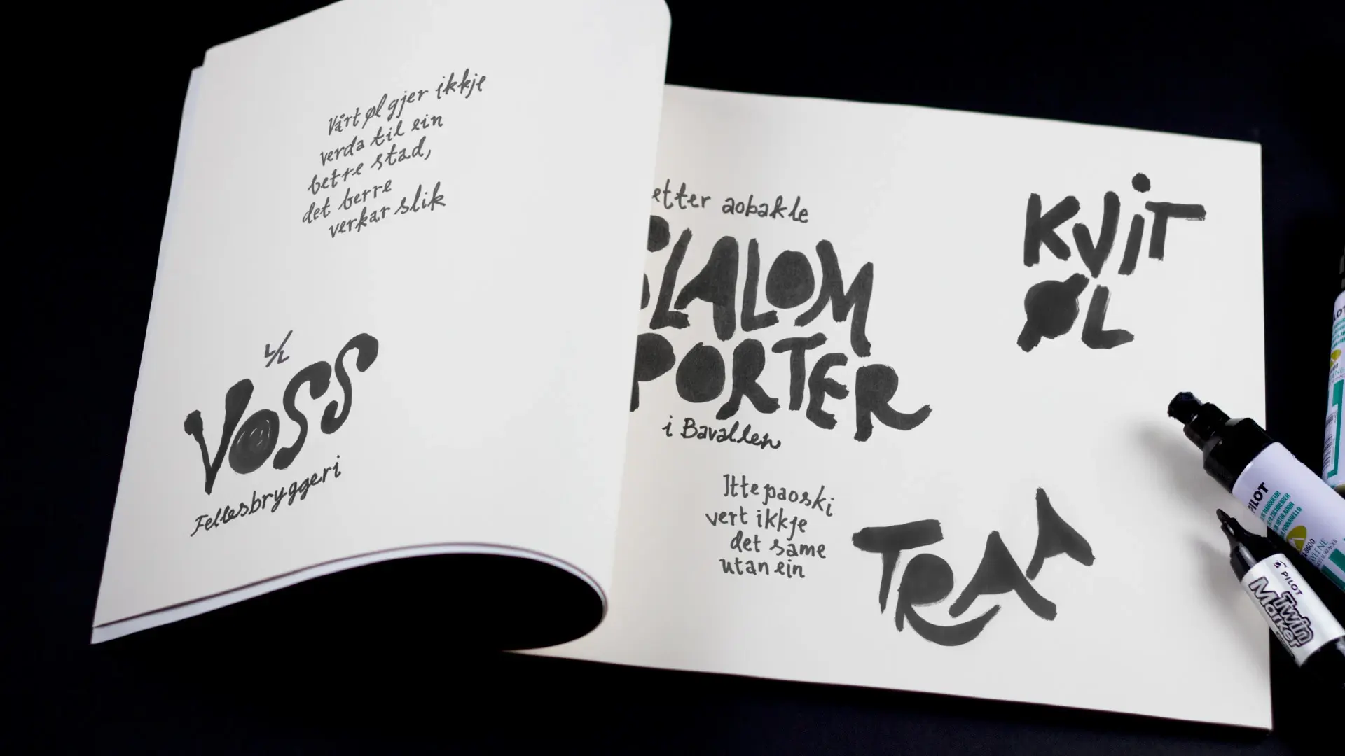
Handwriting as core language
The handwriting wasn't decoration, but the graphic language itself. Its personal, imperfect quality stood in contrast to more polished beer packaging and gave the identity a clearly human character. That made the expression applicable to everything from labels to communication and objects.
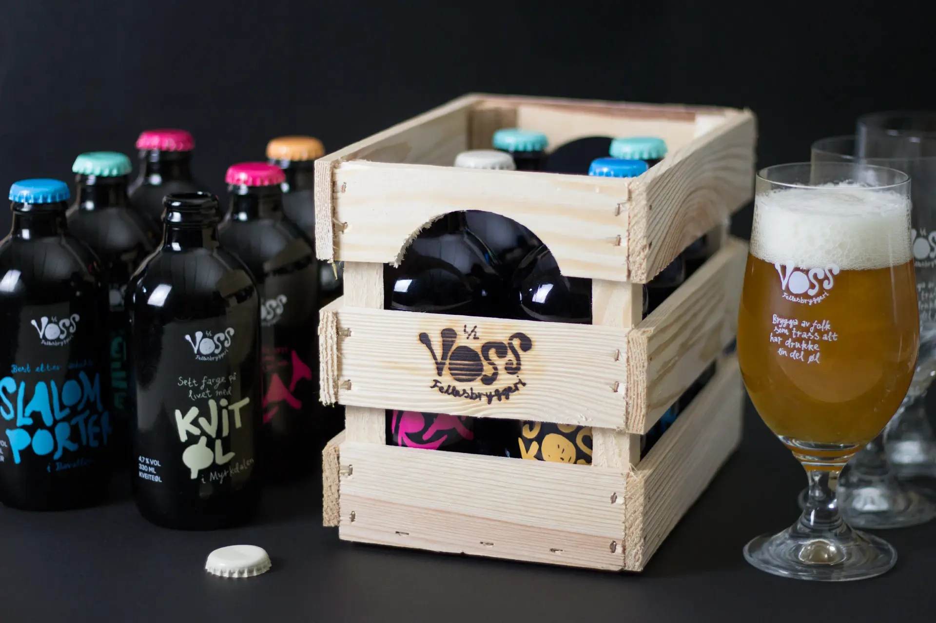
Packaging with character
The compact, black bottles gave the range a strong, consistent silhouette. Contrasting colours told the variants apart, while the wooden packaging carried the tactile, uncomplicated expression further. Materials and form became an active part of the identity, not just something the graphics were placed on.
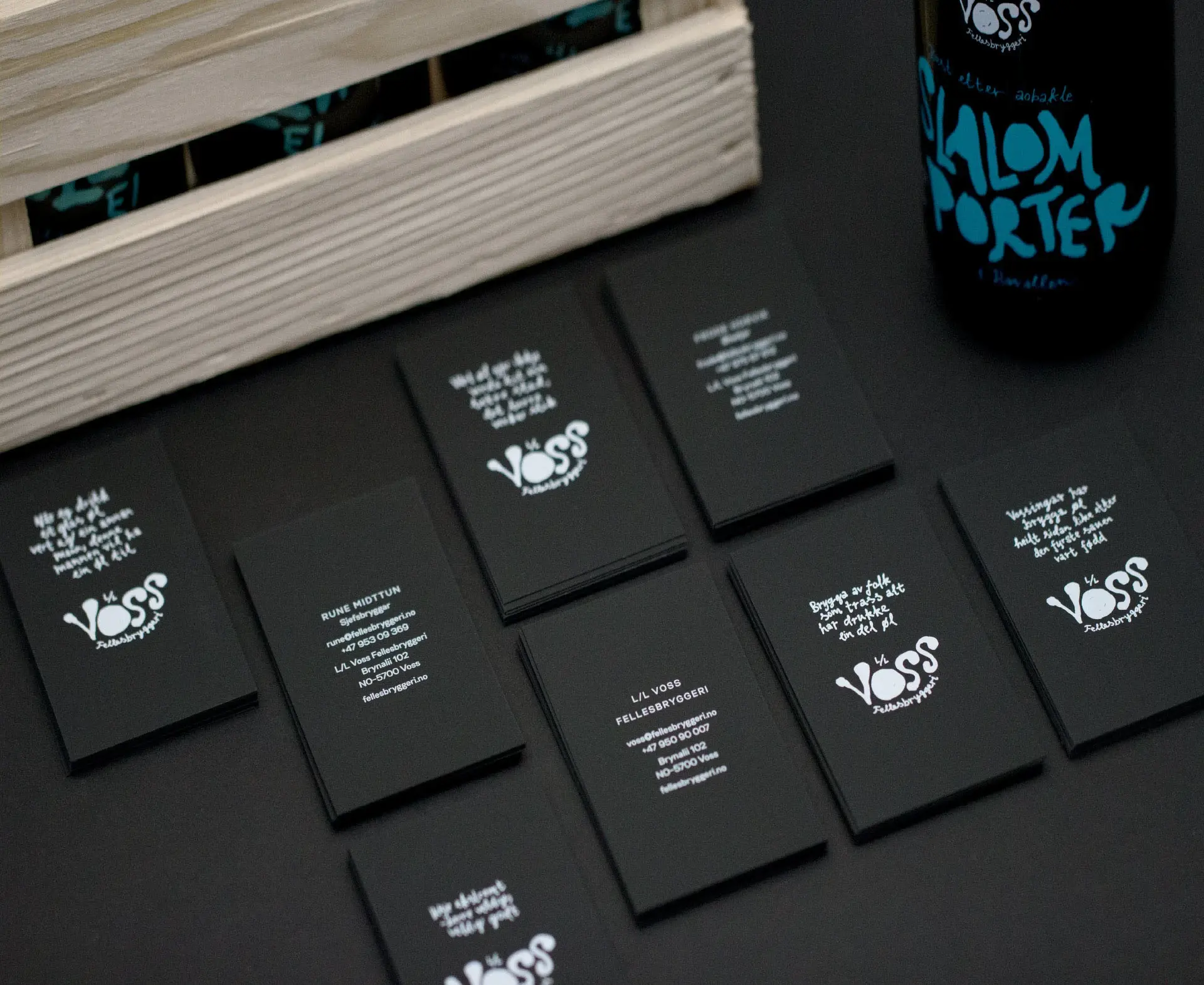
Humour with a function
Phrases like "Brewed by people who, after all, have drunk a fair bit of beer" summed up much of the project's attitude. The humour made the brand more approachable and memorable, but also worked as a signal of confidence. Voss Fellesbryggeri took the product seriously without having to take itself too seriously.