Krone ecological beer
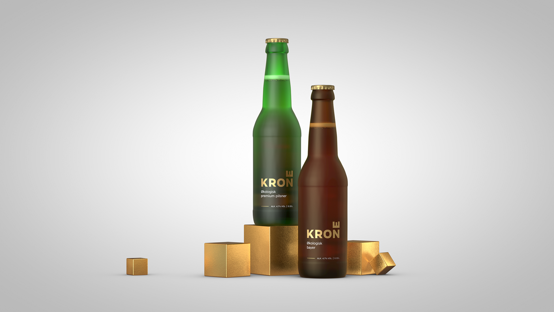
Brief
Krone was entering a market dominated by established Norwegian beer brands and needed to feel credible without looking conventional. As an organic product, it also had to avoid the predictable visual language of eco-packaging. The challenge was to find an expression that could break with the category without losing the sense of quality and beer tradition.
Strategy
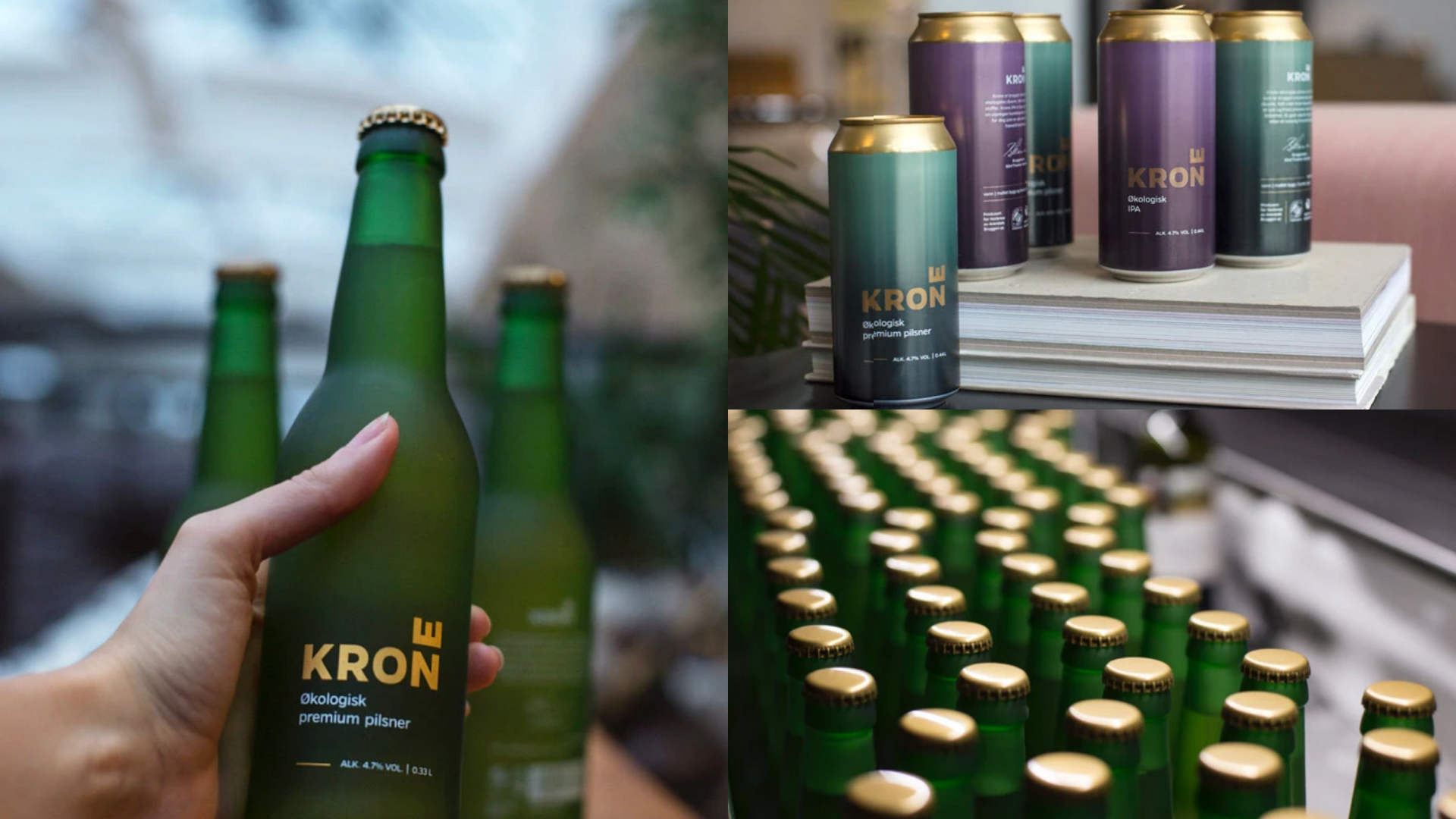
The expression was reduced to its essentials, with materiality, name and form as the carrying elements. The Krone name gained a simple signature in the horizontal E, lifting the wordmark from name to symbol. Frosted glass, direct silkscreen printing and gold were meant to give the product a cool, precise and unusual character, while the expression kept enough weight to belong in the beer category.
Result
Krone gained a clear and distinctive identity with strong shelf visibility, setting it apart from both established beer brands and typical organic products. The frosted bottle became the strongest signature, requiring the manufacturer to develop new production methods. The expression was carried through into matte cans and a tight graphic system, and the project later received broad national and international recognition.
Before the bottle existed
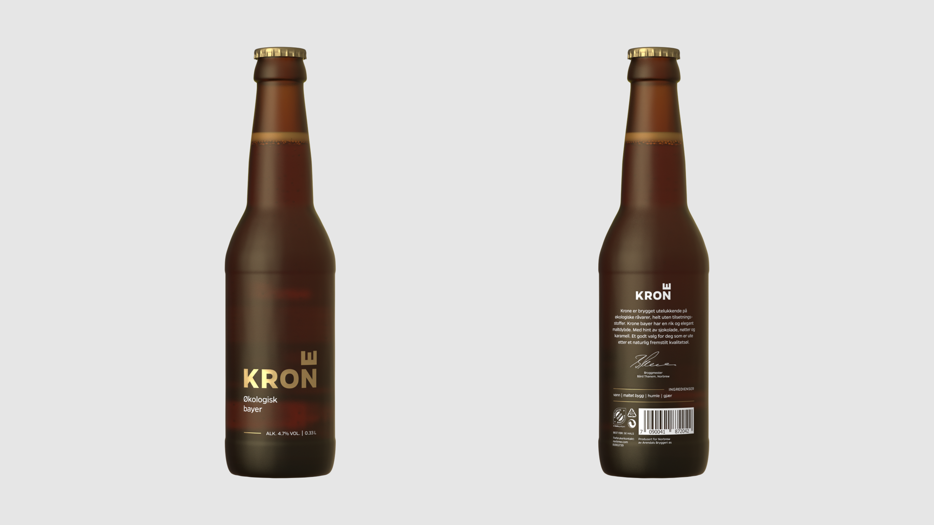
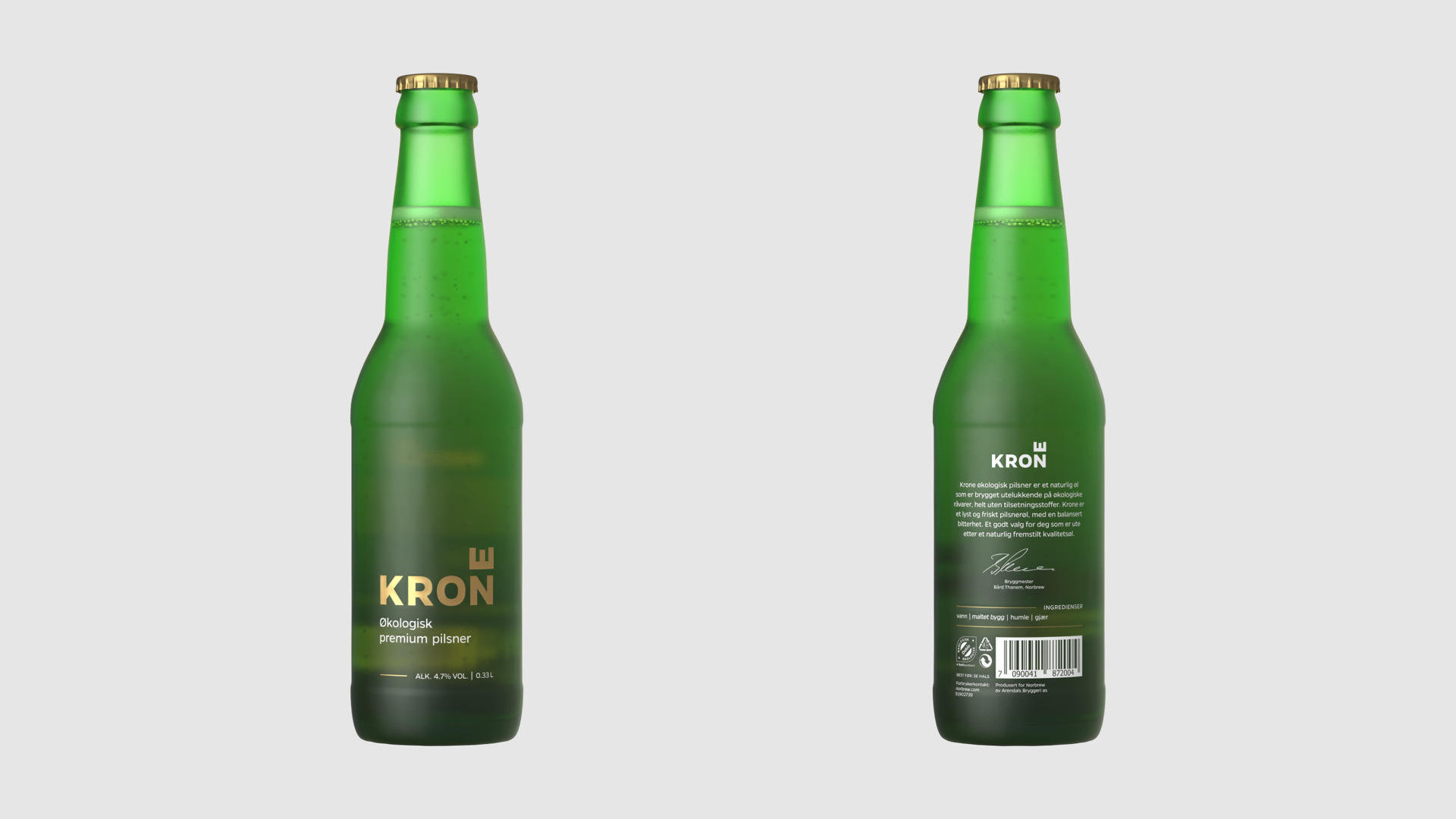
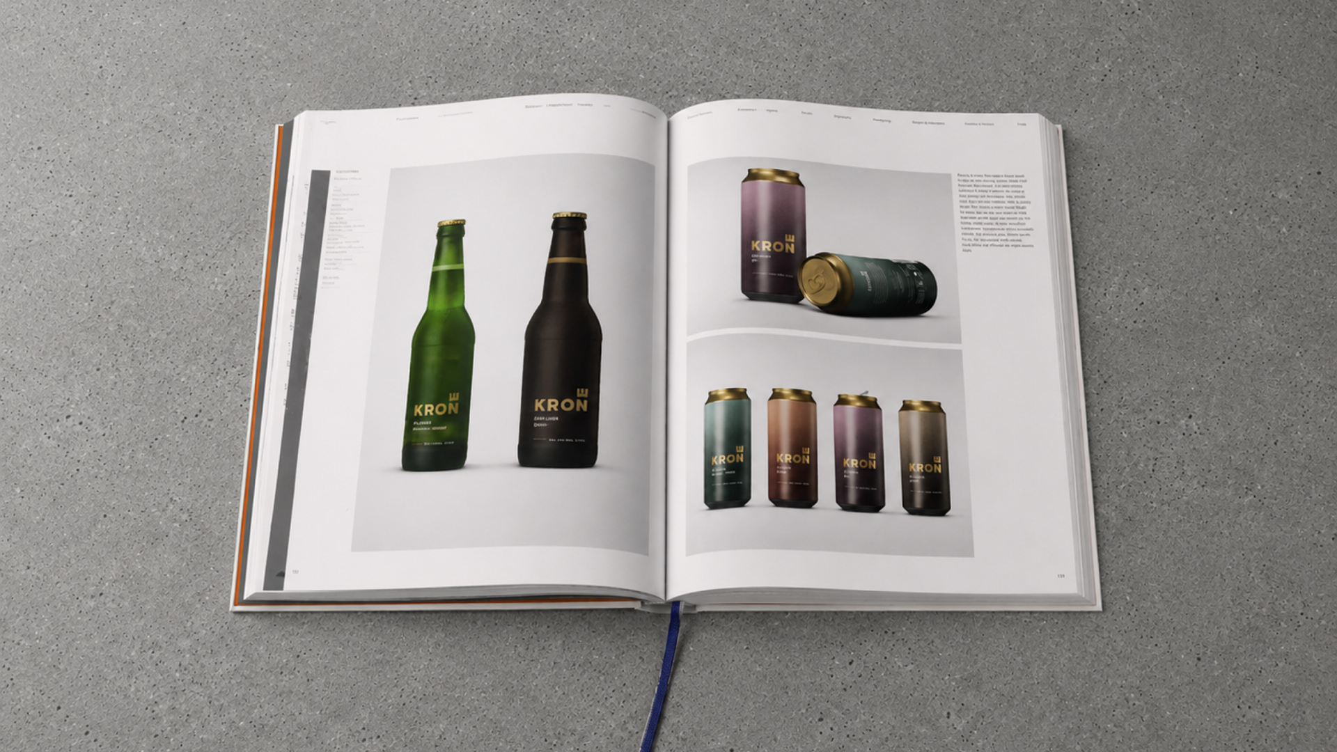
The packaging was visualised before finished bottles were available. This allowed the team to examine proportions, materials, transparency and graphic placement much earlier, turning the render into a form of pre-production prototype rather than simply a final presentation image.
A shared vision
The frosted bottle required the manufacturer to develop a new way of producing the intended finish. The 3D visualisations gave the design studio, brewery and packaging manufacturer a common reference, helping translate the designers' visual intention into something concrete enough to discuss, refine and manufacture.
Materials in context
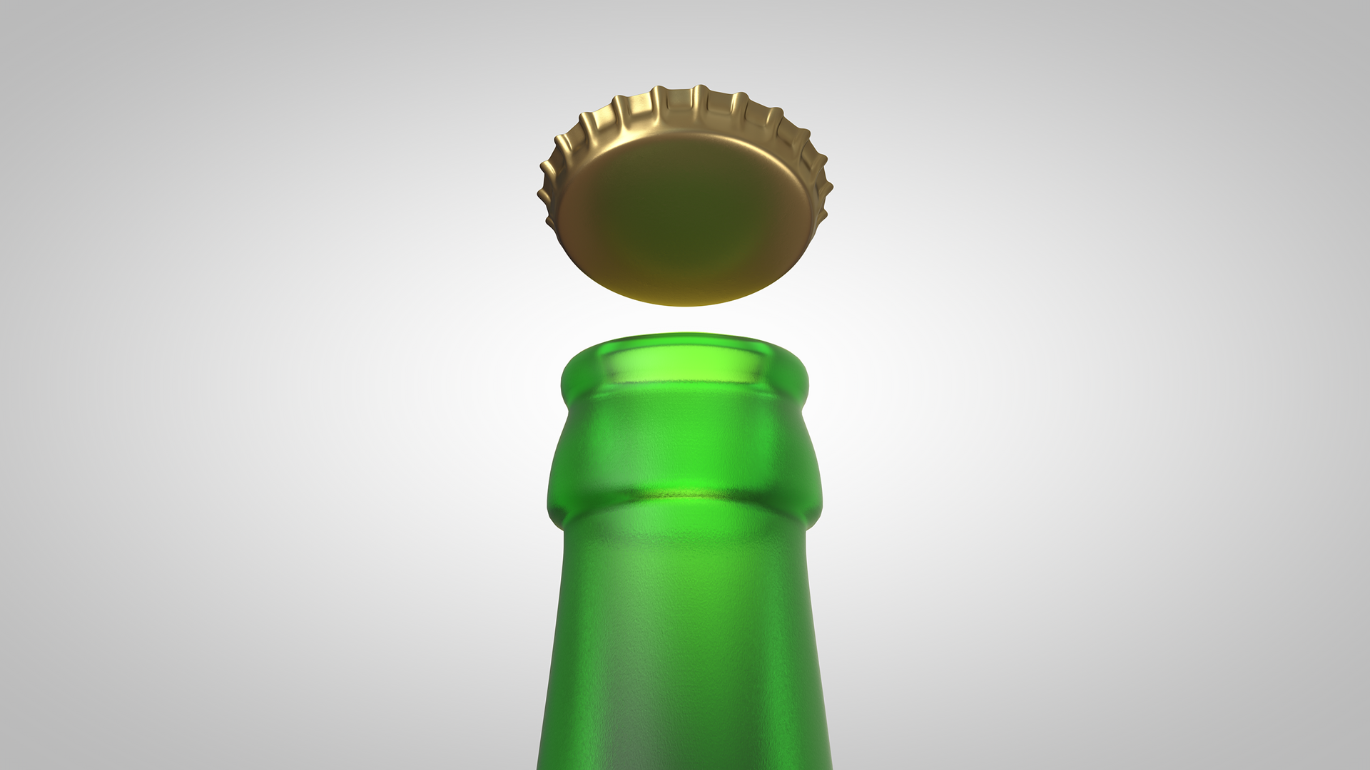
Frosted glass, beer, metallic gold and direct printing all behave differently under light. The matte surface gave the impression that the bottle was chilled and refreshing, even on the shelf. 3D made it possible to see these materials working together instead of judging them through isolated swatches, drawings and specifications.
From bottle to range
The same visual principles were extended across bottles and cans. Matte surfaces, metallic details, restrained typography and muted colours helped different products feel part of one system while still giving each variant its own character.
Less uncertainty
The value of the 3D work was not only better imagery. It reduced uncertainty between design, client approval and manufacturing. The visualisation made an ambitious idea easier to understand, easier to develop and ultimately easier to produce.