Samspill
Brief
Braatthallen wanted to create a public celebration with real ambitions around Norway's participation in the World Cup. The goal was to become an attractive gathering point with high quality across the entire guest experience, from the big screen and sound to food and drink, comfort and atmosphere. The event needed a clear direction that could bring the ambitions together and give the audience a reason to choose Braatthallen.
Strategy
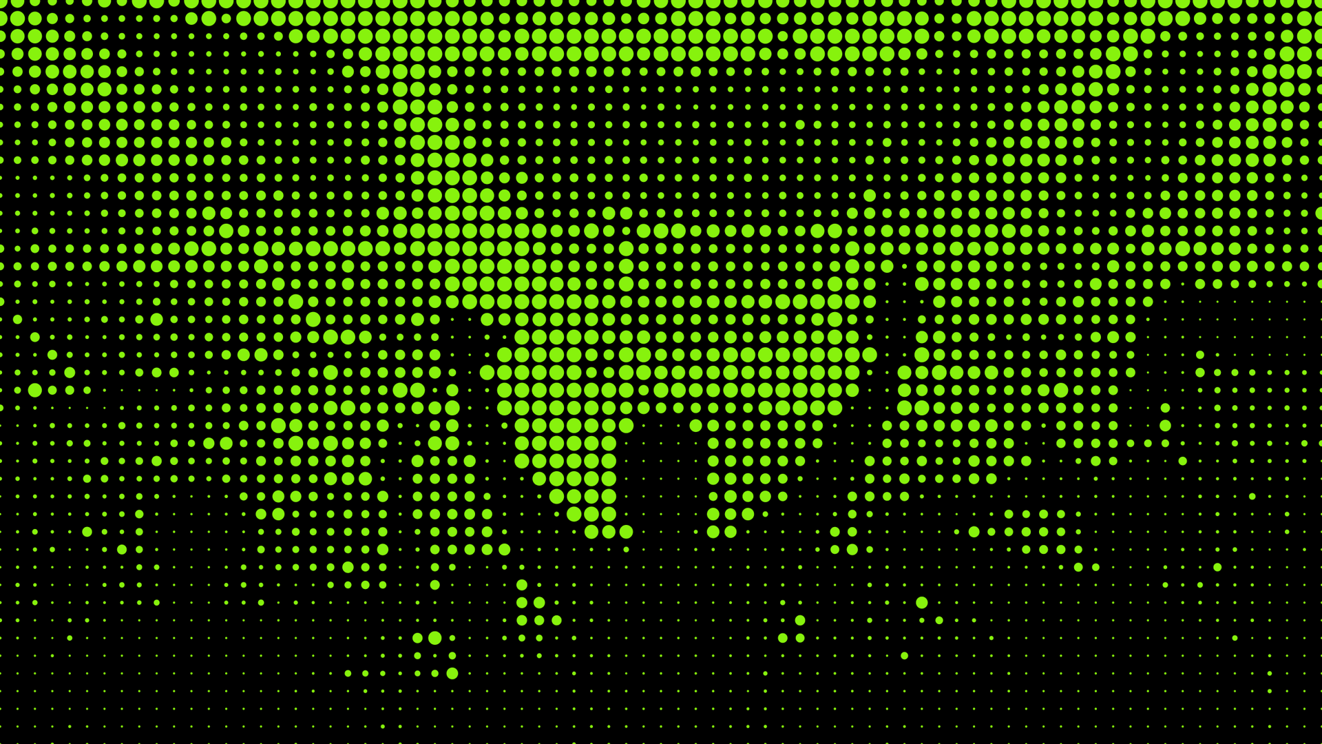
The name Samspill captured the idea of football, community and experiencing something together. The visual language was built around three simple elements: the green of the football pitch, the circular form of the ball, and raster dots borrowed from the aesthetic of the big screen. Together they formed a clear, flexible system with strong recognisability.
Result
Samspill became a clear and attractive option for football fans in the region. The unified communication made the event easy to understand, recognise and choose, while Braatthallen's execution delivered on those expectations. Word spread about the space, the short queues, the quality and the atmosphere, and demand grew to as many as 800 guests at the biggest matches.

Clear at a distance
A poster only has a short window to do its job. So the message was reduced to what mattered most: "Football. Big screen. Together." The date and braatthallen.no told the rest. The coarse raster expression gave the identity its character, while large shapes and few elements kept the communication clear even at a distance.

One system, many formats
The communication had to work on everything from mobile screens to wide digital advertising surfaces. Instead of creating a separate composition for every format, the identity was built around a flexible grid. That gave the freedom to adapt content and proportions without losing the visual coherence.
Easier to be a guest
A mobile-friendly audience portal gathered the most useful information for guests. Programme, map, menus and frequently asked questions were all available via QR codes at the tables. Guests found what they were looking for faster, and staff had fewer questions to handle.
The screens as part of the experience
The venue's many digital screens were used for more than match information. Countdowns, World Cup facts, safety information and celebrations all carried the same visual language, while short films for popcorn and soft-serve helped promote the food and drink on offer. The same surface could inform, build atmosphere and drive sales all at once.

From Samspill to Sampils
The identity also found a more playful application. Sampils was a simple rearrangement of Samspill, developed as its own beer concept for the event. It took the graphic language off the screens and onto a physical object, giving the brand a natural place at the table where the audience actually gathered.